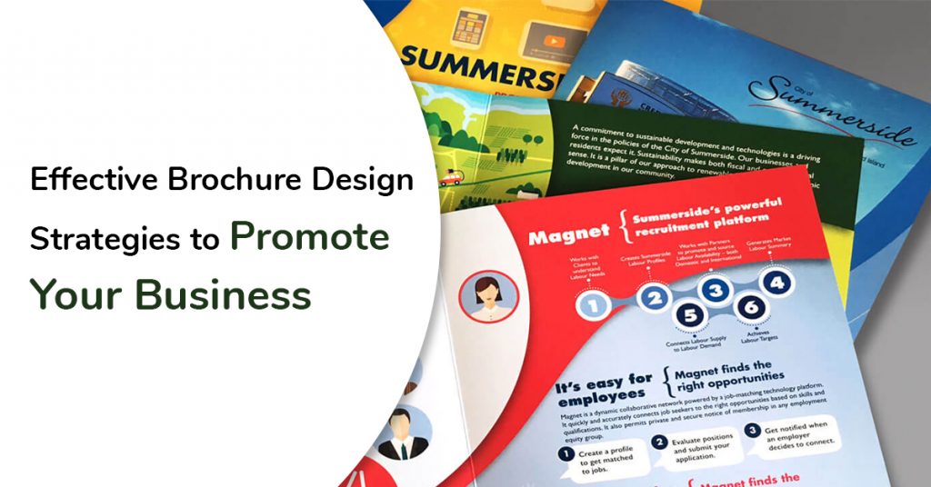
Summarising business is an art and is scintillating ! With effective Brochure Design Strategies, you can promote your business and give an extra edge. For years,this has been the hallmark of running a business strategy.
A brochure is the reflection of your business. A poorly designed architecture may kill the zeal & excitement of your would- be stakeholders.
All this are equally possible to revoke your marketing strategies.It’ll certainly raise benefits and foster excellence for website designing.
A remarkable design will attract that automatically grabs’ attention of onlookers.
Through this piece, you’ll come across brochure design strategies which may suit your business model.
Define your business objective and target audience
The moment your brochure is picked this should convey the idea of what the business is all about. Assume you in a property business? Every business reflects different USPs and brochures should primarily focus on that.
Images are the true reflection of your business. This is like a demo. Towering building and strategies which may get you the desired results. Skyscrapers, villas must reflect the true nature of the business.
Be Specific and Get To The Point
This is not a guide or like an Encyclopedia. Highlighting the key points on the brochure,but deviating too much information kills the joy & curiosity factor. This is not like a website where you keep on adding info. Not either a record book. It is an album of your brand.
Remember the passion in your eyes
Remember the passion in your eyes. Looking at your wedding albums rewinds old sweet memories.? That is how your stakeholders want from your brochure.
Go through your achievements and streamline the practices
- Mention key points that should pierce through users’ attention
- Mention Specialities & key requirements that benefit customers
- Use power words, superlatives that add distinctions.
- Offer a free quote or free consultation, and is free in the brochure.
Focus on meeting customer requirements
No one buys features but buys their requirements that meet certain specialities. Like in weddings your photographer clicks many pictures but you choose one that is special for the occasion.
Leverage visual storytelling
Aren’t we blessed with a photogenic brain ?. A picture speaks louder than words. This way readers can consume information from graphs and charts that give concrete reason to your brand.
Invest Your Trait On First Page
Like the cover page of your book, the front page of your brochure determines whether the reader will hook it up or not. Skilled professionals at any reputed brochure design company recommend putting every effort to make it rather compelling.
Front-Page Design Example
Check out an example of the front-page design: You can always give a clear, and concise statement about how you cater to customers’ requirements.
Evoke Curiosity
This may even start with an intriguing question..How can ignite confidence in customers to evoke the readers’ curiosity?
Evoke Curiosity
Of course, the front page should have bold and attractive fonts, appealing pictures, company names, and logos. That makes the tagline spicier.
Add suitable Images
Give reasons to your viewers whether your leaflet is not boring at all. Nothing is better for your budget if you are looking for a beautiful booklet..Igniting the users’ interest is the key. This entails a QR code to enhance readers convenience. The brochure design experts identify pictures to suit your business brochure.
Selection of High-class choosy Paper
A glossy page gives your user the same experience. Anaesthetic appeal almost captures the attention of viewers. So no one would want to tarnish their web image with just bad papers.
If you want to create a positive impression then promote a distinct corporate identity while keeping an eye.” Remember you for an interview and are neatly dressed for having a lasting impression”
Include Call-to-Action
People don’t opt for a product or pay a visit to your hotel for a beautiful brochure. You need to motivate what is the next step.
So, no matter how well-designed a brochure is, there is no use if it doesn’t have a suitable Call-to-Action (CTA) element. You can motivate them to share their views on closing the deal.
Also, if you want people to respond, it’s important to make your contact details prominent. So, keep the business name, logo, contact details, and the website URL visible in the brochure.
You add a social media account of your company to evoke brand reliability. Also, this includes a QR code to enhance readers convenience.
The Vibrance of Colours
Colours define emotions, moods, character & actions. So why not use it to full effect!
Too many shades often make it rather clumsy. and affects readability. So keep it simple. It’ll be helpful for creating a bold design. This creates a code, design, colour combinations that define success. It’ll certainly leave a lasting impression in creating a bold and trendy design.
Designing a brochure is often the most difficult phase. Be it content, images or designing everything is made final by professionals for the sake of choosing the right colour combination of the brochure.
So, in a nutshell, you may not convey information that jeopardizes your chances among visitors.
You can always embrace these tips that’ll allow creative insights. It’ll certainly help a great deal in creating a lasting impression. This makes choosing a designer going a long way in making design special. It’ll certainly raise aspiration to business and ignite confidence among your stakeholders.
So why are you waiting? Just move on with a marvellous brochure design.


